
Year: 2017
Role: Logo & Brand Designer
Overview
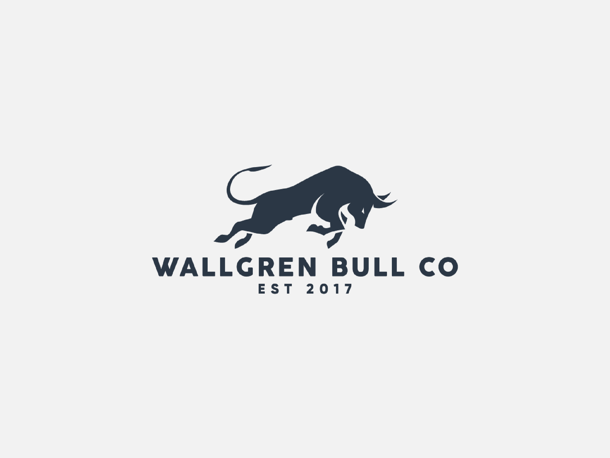
Wallgren Bull Co is a contemporary brand established in 2017, inspired by strength, determination, and forward momentum. The company sought a bold and timeless logo that captures the power and resilience symbolized by the bull.
Design Objective
The goal was to design a logo that embodies confidence and motion while maintaining a clean, modern aesthetic. The logo needed to be versatile — adaptable across digital, print, and merchandise applications — while conveying the brand’s core values of reliability and strength.

Concept & Rationale
The centerpiece of the logo is a stylized charging bull, symbolizing power, endurance, and progress. The minimalist silhouette approach ensures clarity and scalability. The forward-leaning motion of the bull represents ambition and growth, aligning with the company’s ethos.
The typography complements the symbol with a bold, sans-serif typeface that reinforces stability and modern professionalism. The deep navy color palette was chosen to communicate trust, authority, and sophistication.
Outcome
The final logo delivers a strong and dynamic identity for Wallgren Bull Co, successfully balancing modern design with symbolic depth. It captures the essence of the brand and establishes a visual mark that stands out with confidence and purpose.
Leave a Reply